Web interface
The web interface is the default frontend. Starting the app in any form serves it: vault-assistant (or ./run.sh) starts the Bun server and prints a local URL, http://localhost:5173 unless you changed the port, and the desktop app wraps this same interface in its own window.
First run
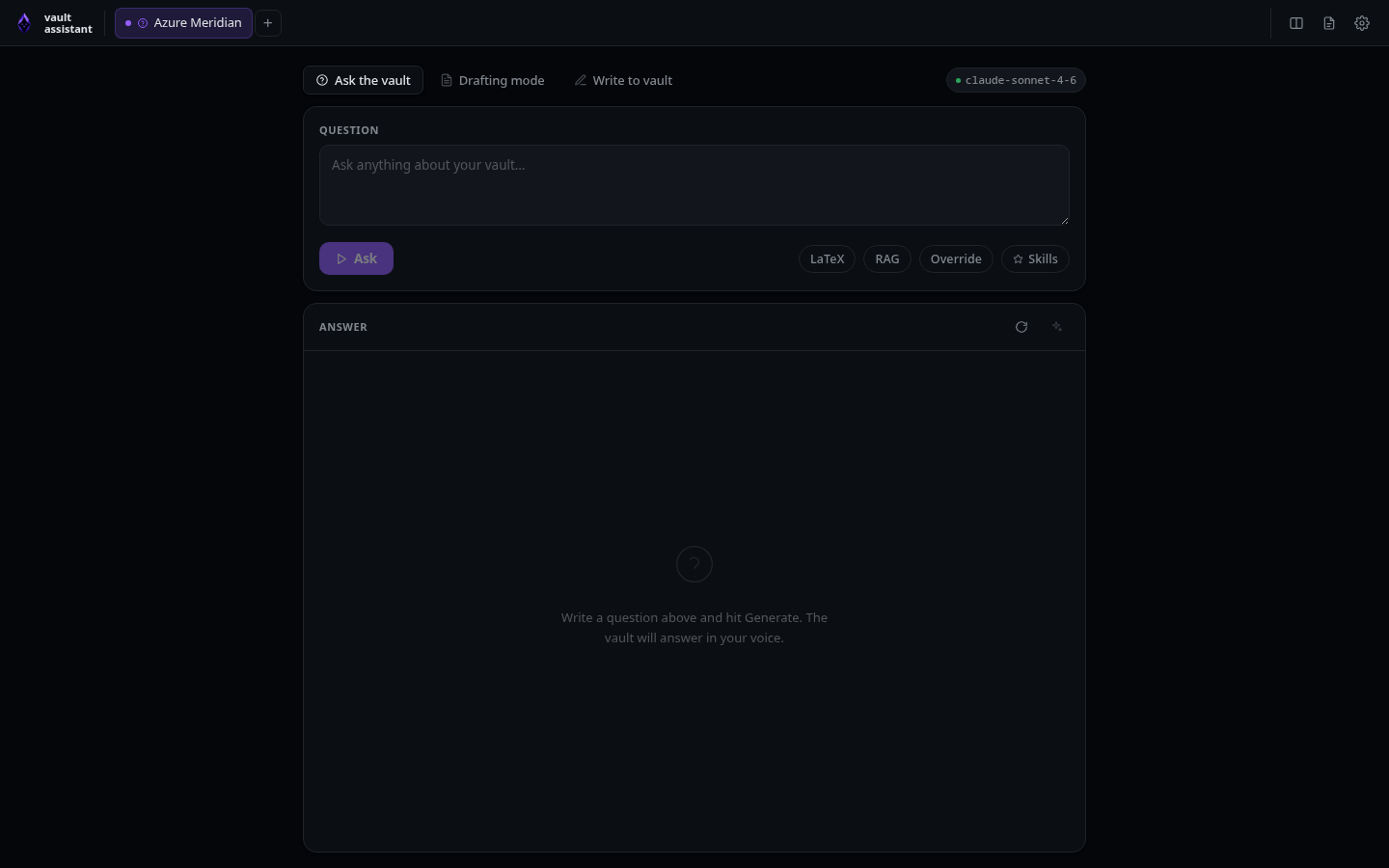
The first time you open the app, an onboarding wizard collects your name, your role, the absolute path to your vault, and optional voice notes about your tone. From those fields it builds the system prompts for Ask mode and Draft mode, which you can edit right in the wizard or later under Settings. You can also skip the whole thing and configure everything afterwards.
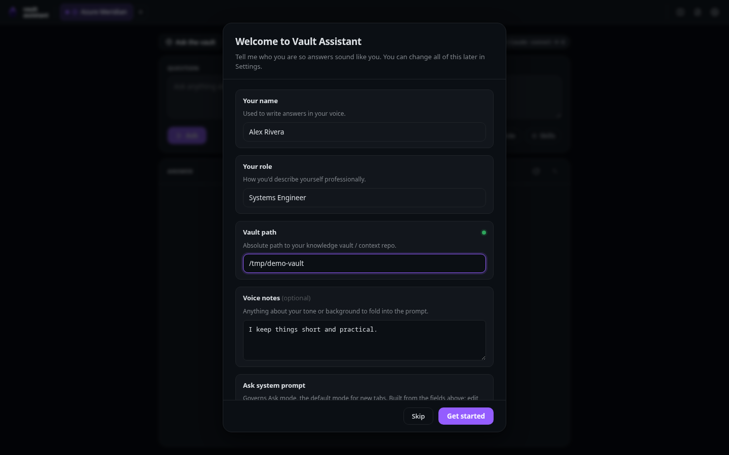
After the wizard, a welcome walkthrough introduces the three modes. The same content stays available under Settings, on the Getting started page.
Tabs and sessions
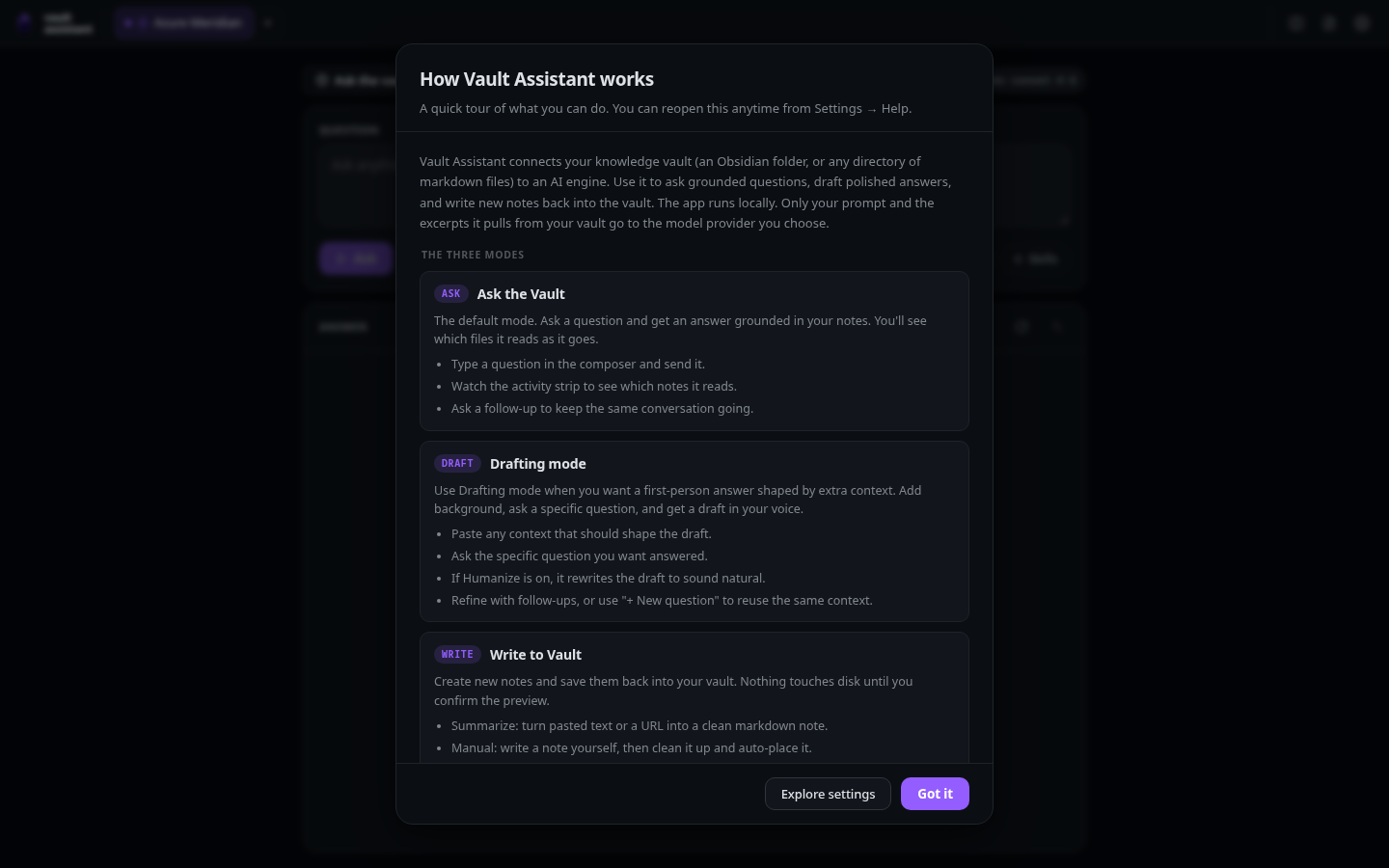
The web interface is built around tabs. Each tab is an independent conversation with its own mode, question, context, and settings overrides, and generations in different tabs run concurrently.
- New Tab button (+): Located next to the tab list. Click to append a fresh session tab. Low-level action: calls
newTab()to add a new tab record to state, defaulting to your configured default tab mode. - Tab close button (×): Located on each tab label. Click to delete a session. Low-level action: removes the tab from state and deletes its active session ID from
.sessions.jsonon the server.
You can rename tabs and give them colors to keep parallel work apart.
Global header controls
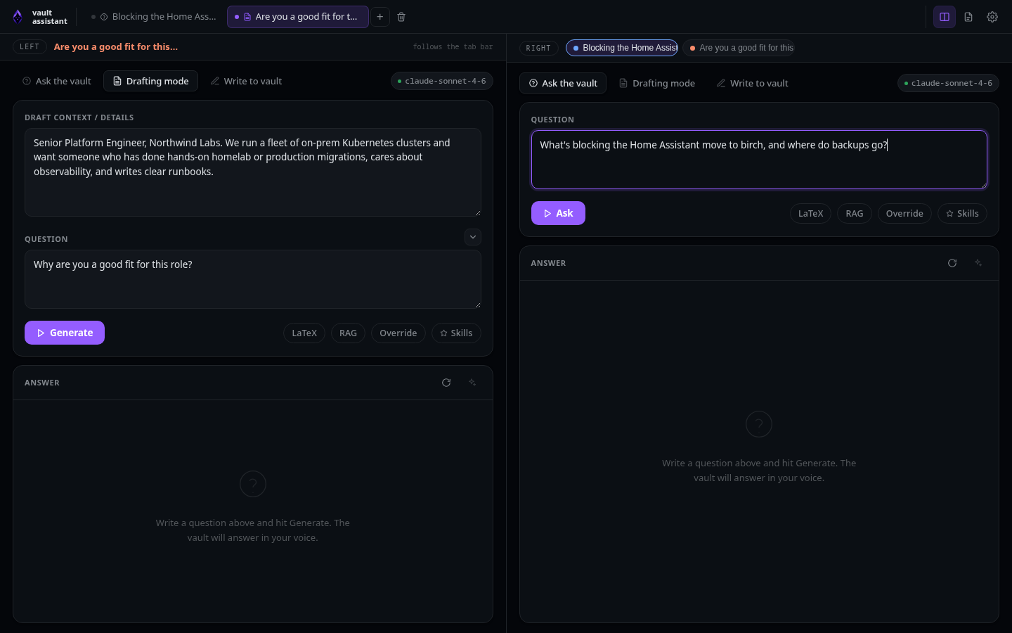
The top bar of the application contains global settings that affect the entire interface:
- Theme toggle (☾/☀ button): Located in the top right. Click this button to switch between dark and light modes. Low-level action: sets the
data-themeattribute on the<html>element todarkorlightand saves the selection inlocalStorageunder the keyjt.theme. - Density toggle (▢/▣ button): Adjusts layout spacing. Click to switch between compact and comfortable settings. Low-level action: sets the
data-densityattribute on the<html>element tocompactorcomfortableand saves the selection inlocalStorageunder the keyjt.density. - Fun background selector (✨ button): Cycles through animated canvas backgrounds. Low-level action: sets the
data-funattribute on the<html>element toonand activates the canvas rendering loop in FunBackground.tsx. - Split view toggle (◫ button): Splits the main screen into two parallel columns. Low-level action: toggles the split-pane layout state, saves the preference as
onoroffinlocalStorageunder the keyjt.split, and renders two independentTabViewinstances side by side. - Shortcuts helper (? button): Displays the keyboard shortcut overlay. Low-level action: sets the
shortcutsOpenboolean totruein React state, showing a modal cheat sheet of key bindings. - Settings panel button (⚙ button): Opens the primary settings drawer. Low-level action: sets the
settingsOpenboolean totruein React state to reveal the configuration panel.
Quick notes
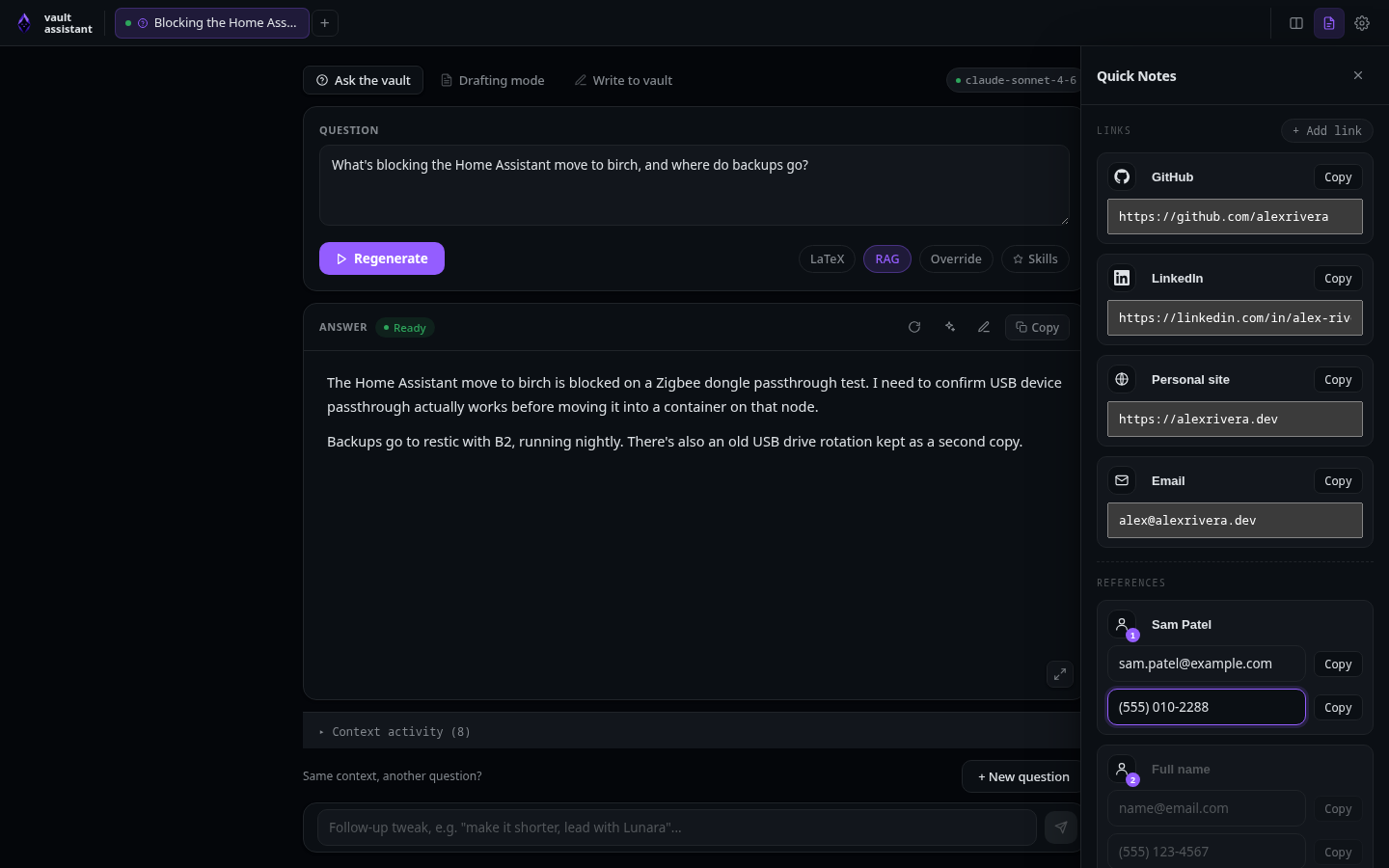
Quick notes is a drawer for text you reuse often: profile links, professional references, and labeled note boxes. Everything in it lives in localStorage on your machine, and clicking an entry copies it to the clipboard. Open it with Alt+N.
Keyboard shortcuts
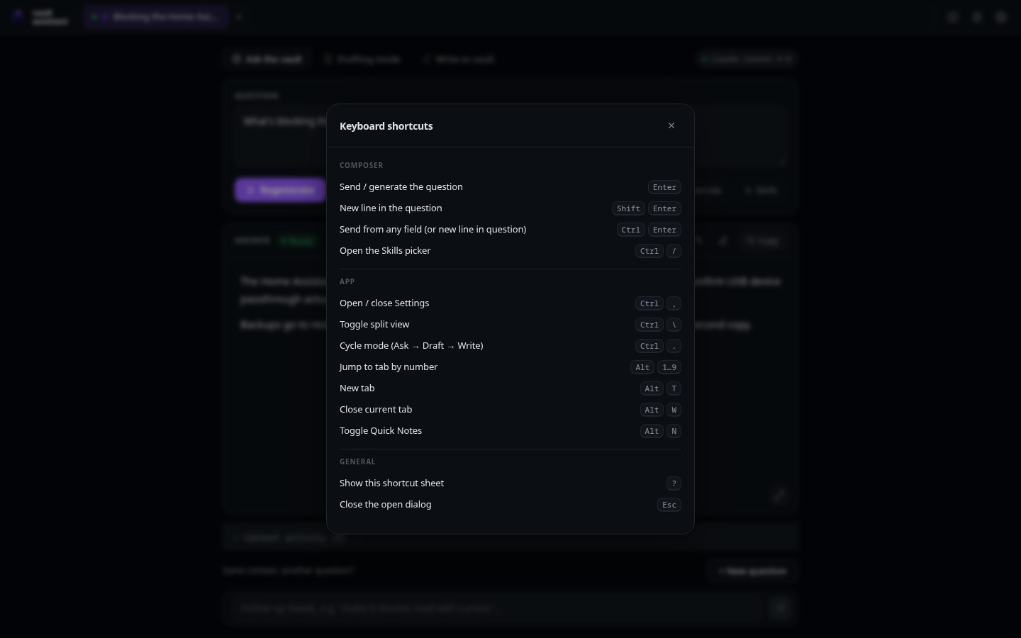
Press ? anywhere outside a text field to open the shortcut overlay. The bindings accept both Ctrl and ⌘:
| Shortcut | Action |
|---|---|
Enter / Shift + Enter | Send / insert newline in the question field |
Ctrl + Enter | Send from any field |
Ctrl + / | Open the skills picker |
Ctrl/⌘ + , | Open or close Settings |
Ctrl/⌘ + \ | Toggle split view |
Ctrl/⌘ + . | Cycle the active tab's mode (Ask → Draft → Write) |
Alt + 1 … Alt + 9 | Jump to a tab by position |
Alt + T | New tab |
Alt + W | Close the active tab |
Alt + N | Toggle quick notes |
Esc | Close the open dialog |
Usage and logs
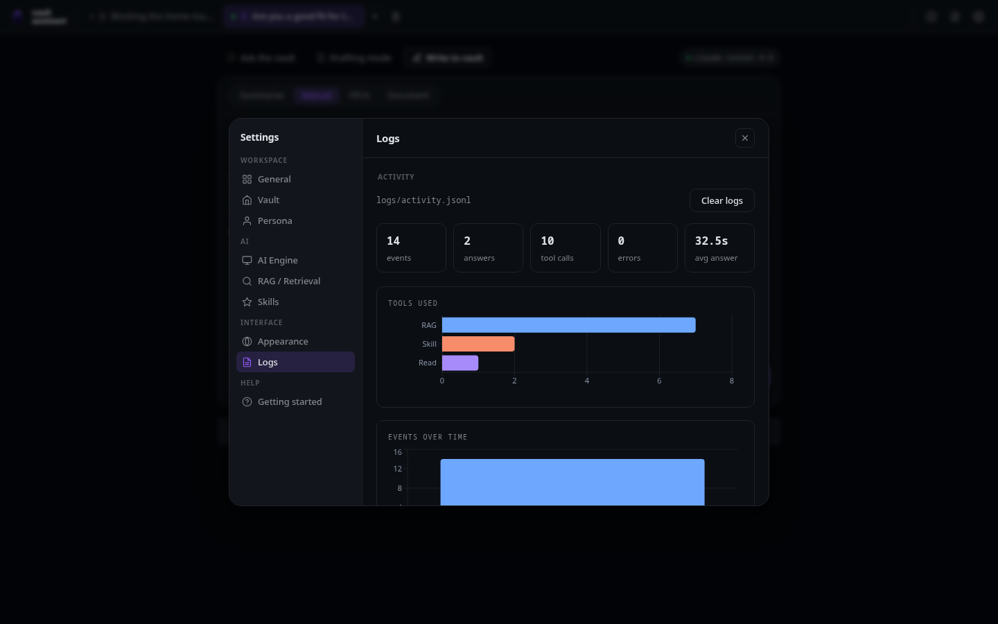
The Logs page in Settings lists recent generations with timing charts, so you can see how long answers take per engine. A usage widget shows provider usage for the selected engine and model when the engine exposes that information, including when the limit window resets.
PDF preview
When a generation runs with the LaTeX toggle on, the web interface shows the compiled PDF inline, next to the compiler log. You can edit the LaTeX source and recompile without leaving the page, then download the .tex or .pdf. The controls are described in Ask mode.
What the other frontends share
The desktop app is this exact interface in a native window, so everything above applies there too. The terminal interface covers the same three modes but drops the multi-tab workspace and visual extras; its page lists the differences.